GRAVITY
IDENTITY DESIGN
Gravity Fitness is a fitness center located in a busy commercial area. The gym offers a range of fitness programs, including strength training, cardio, and group classes. They were looking to refresh their brand identity to better reflect their commitment to health and wellness and attract new customers.
PROJECT OVERVIEW
The goal was to create a modern and dynamic brand identity that would stand out in a competitive market. The new brand identity needed to be flexible enough to be used across all marketing materials, from digital to print, while also being easily recognizable, unique, and memorable.
OBJECTIVE
To begin the design process for Gravity Fitness, I started with a comprehensive discovery phase to understand of the business’ mission and brand values. I then sketched a range of design concepts that would best represent the brand and resonate with its target audience.
Following that, I developed the visual identity, which included the logo design, typography, color palette, and imagery.
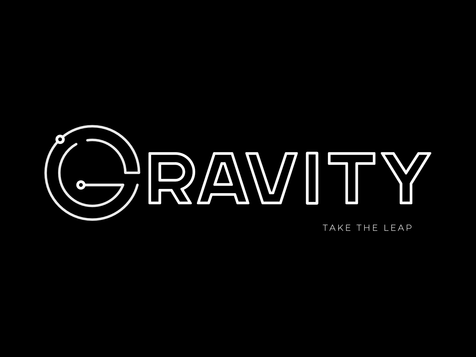
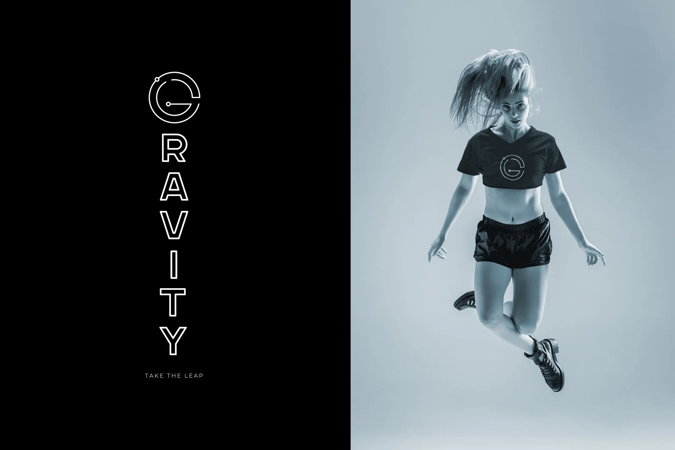
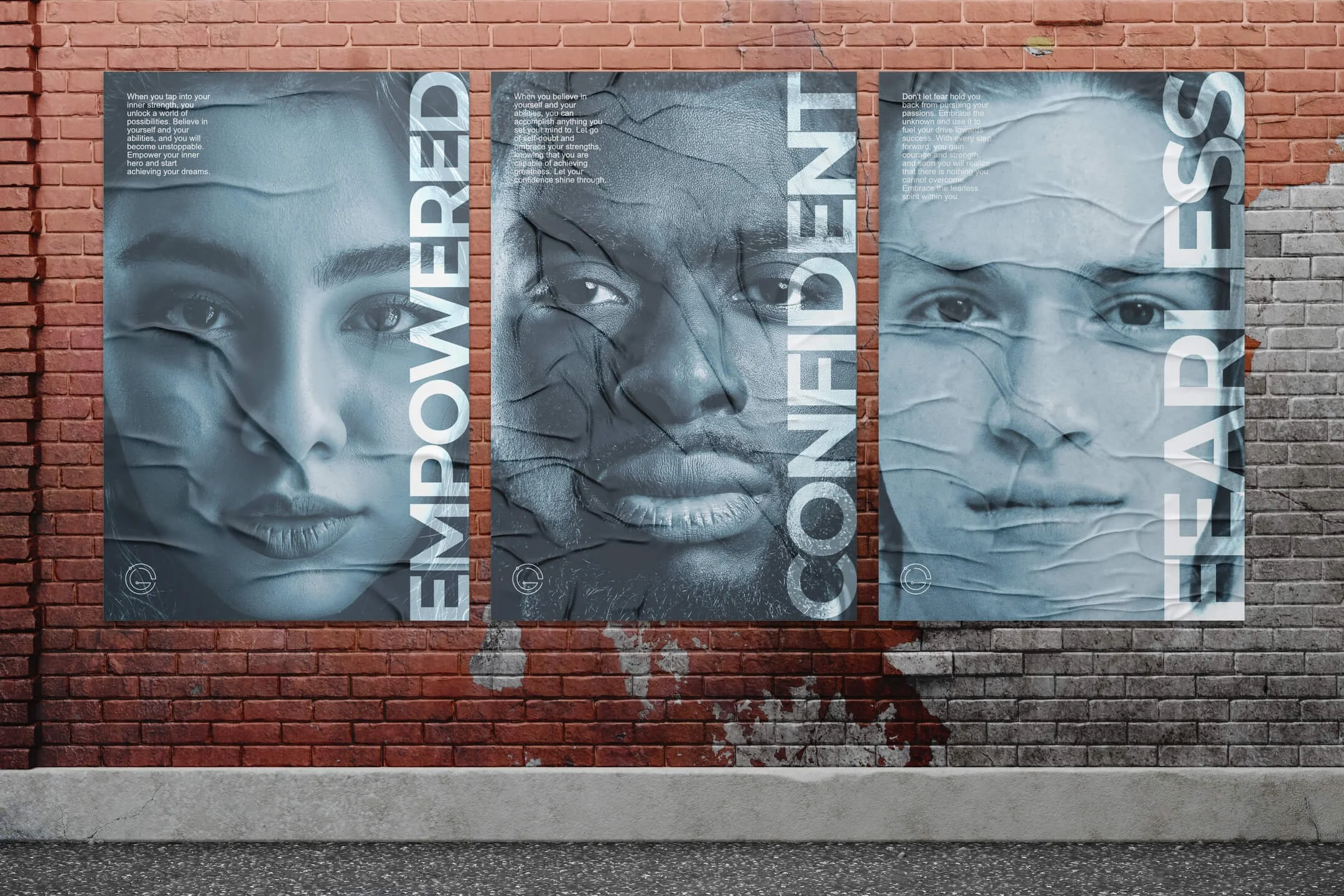
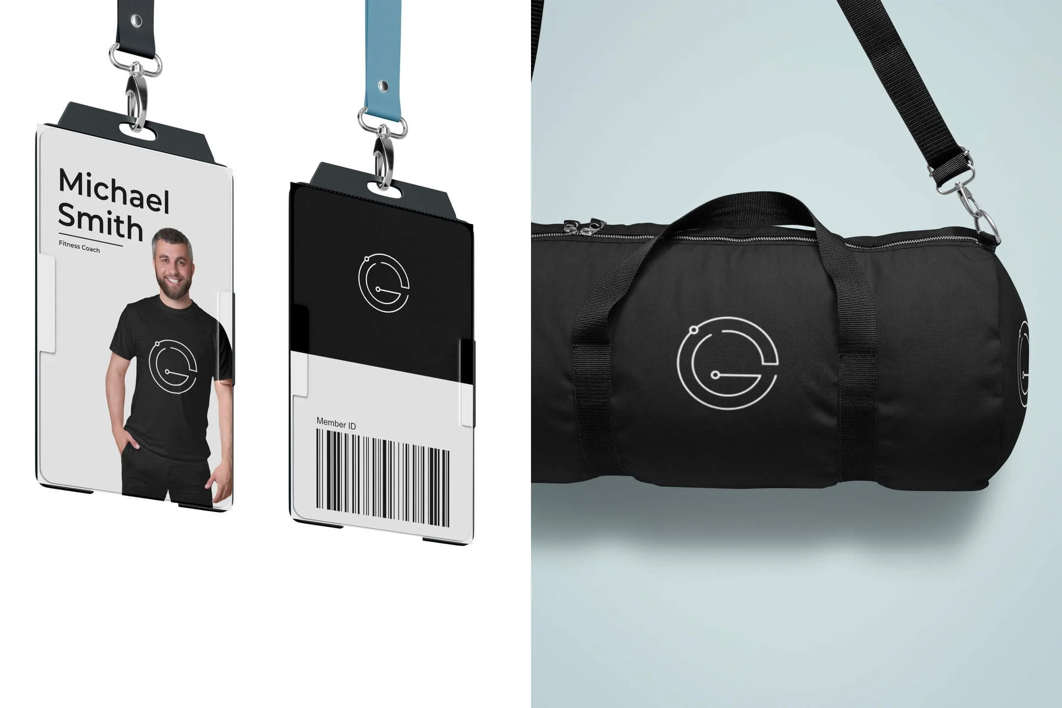
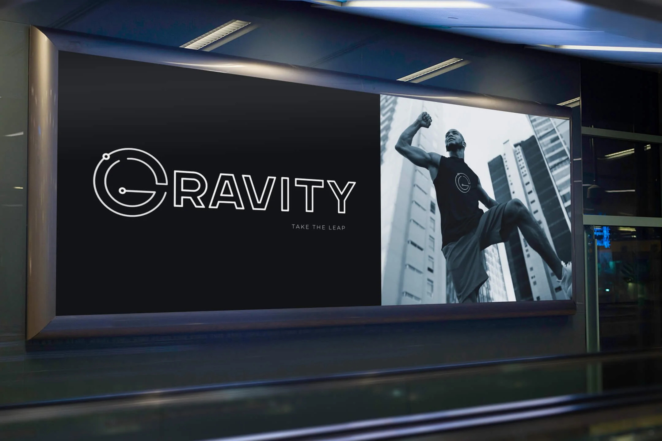
The final logo design for Gravity Fitness features a bold and modern design, with a stylized letter G that incorporates orbiting planets. The typography is sleek and contemporary, using the font family Montserrat. The color palette is primarily black and white, with soft blue to convey stability. The imagery used in marketing campaigns features dynamic photographs of people jumping through air and motivational character trait portraits.
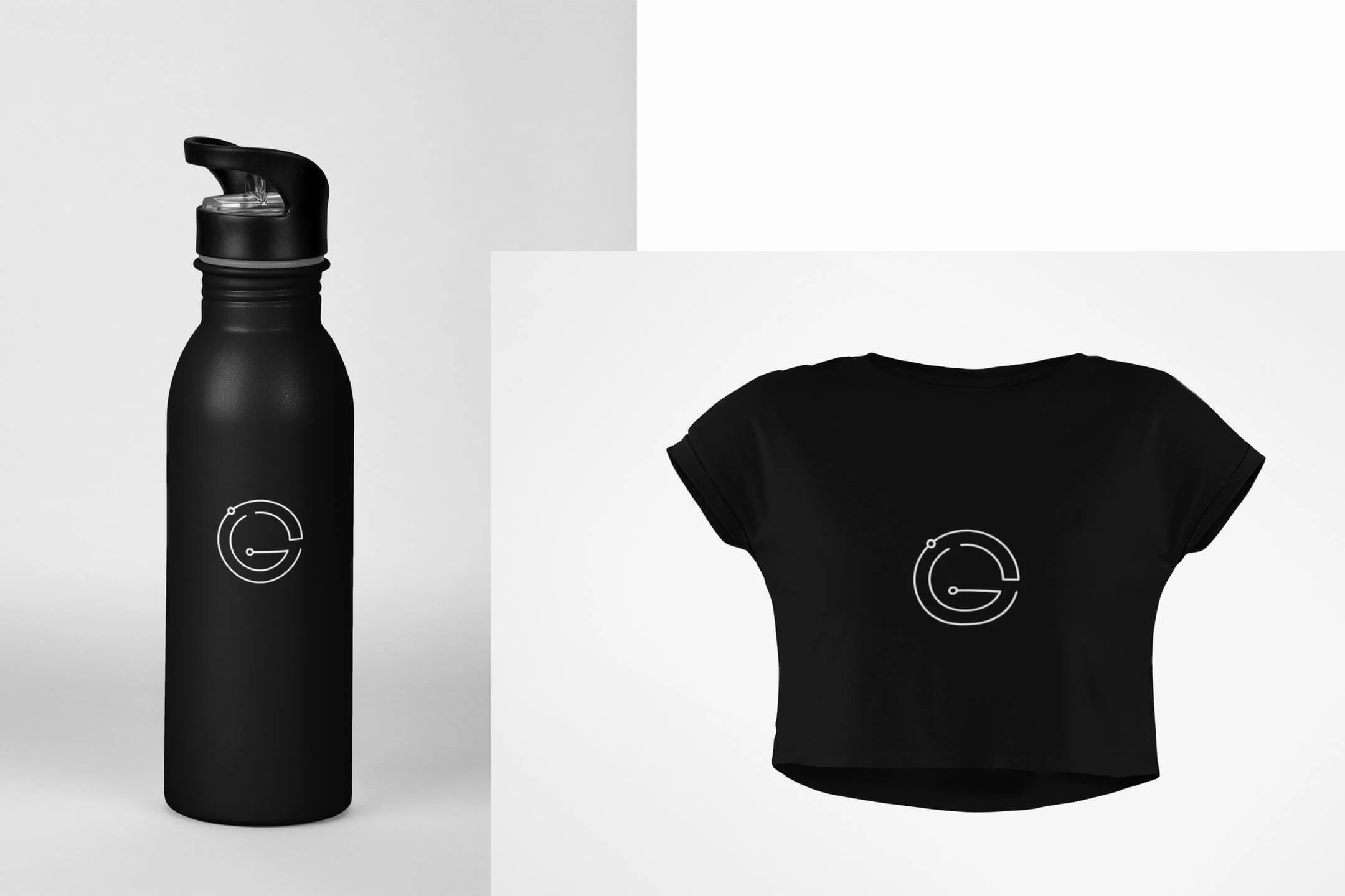
Once the visual identity was established, I applied it to various mockups. I ensured that the brand identity was consistent across all touchpoints, creating a cohesive and memorable brand experience for Gravity Fitness's customers.
PROCESS
Overall, the design process for Gravity Fitness was an extremely fun project that produced a strong and distinctive brand identity. The resulting visual identity captures the essence of the brand, reflecting its values, and positioning it for success in the competitive fitness industry.

