
ZESTI
IDENTITY DESIGN
PACKAGING DESIGN
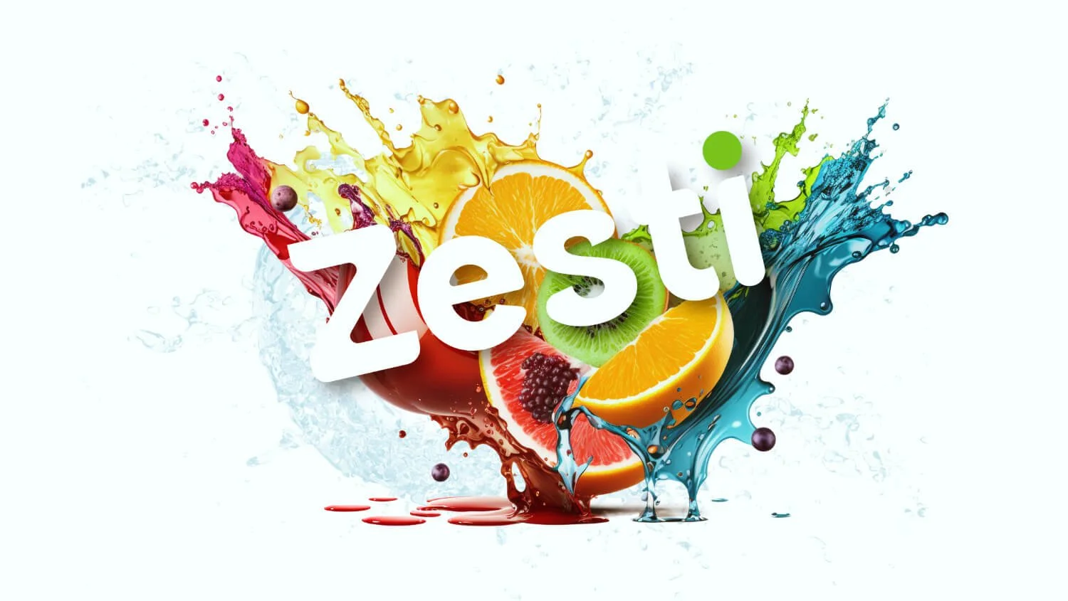
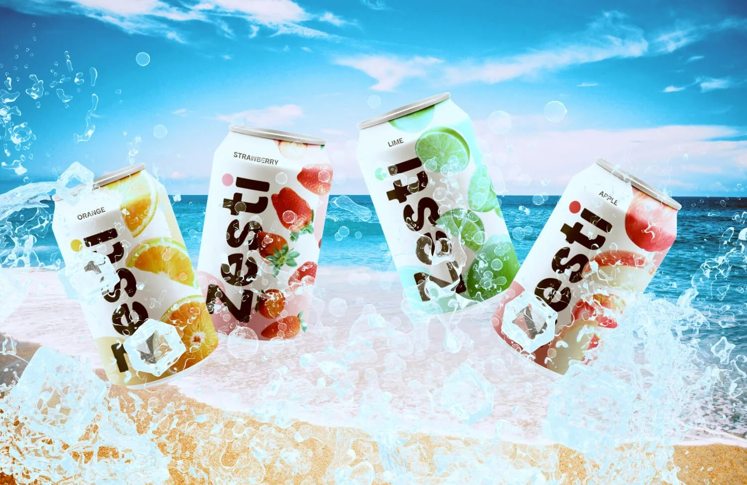
Zesti is a brand identity and packaging design for an all-natural drink made with real fruits. The brand's refreshing flavors, including apple, lime, lemon, strawberry, lemon and orange, make it the perfect drink to cool off during the hot summer days.
PROJECT OVERVIEW
The objective was to create a brand identity and packaging design that conveys the all-natural and refreshing qualities of Zesti. The brand should appeal to health-conscious consumers who value natural ingredients and enjoy refreshing sweet drinks.
OBJECTIVE
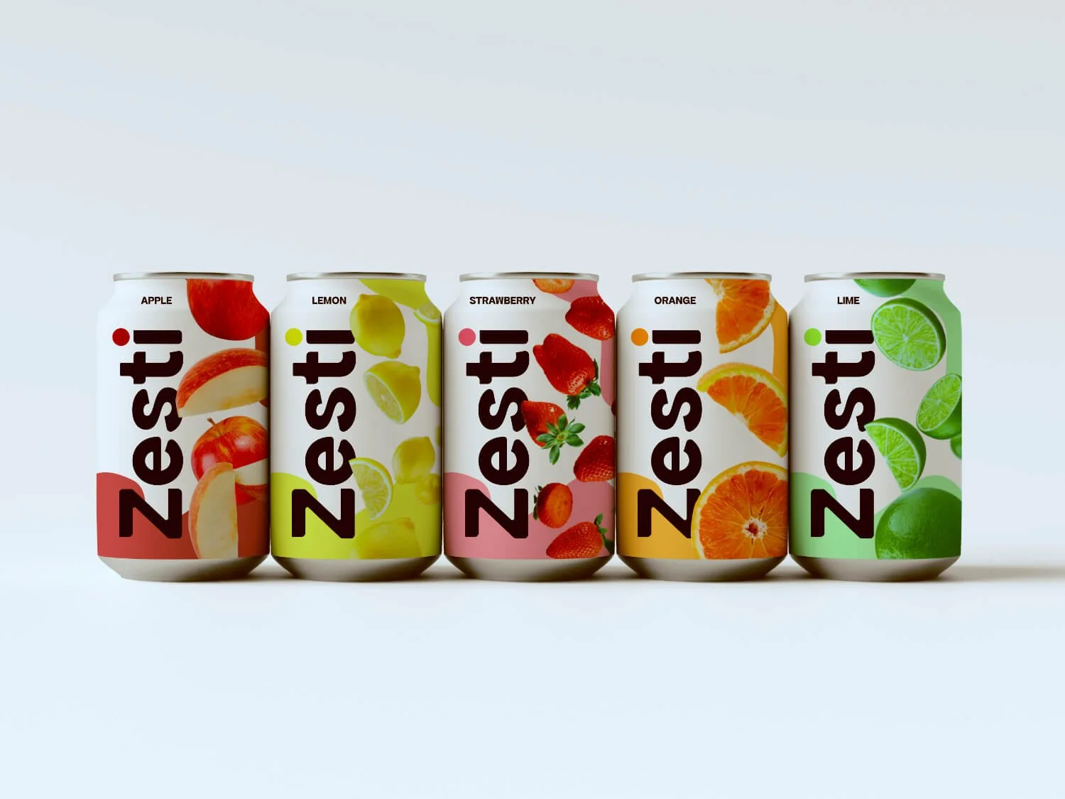
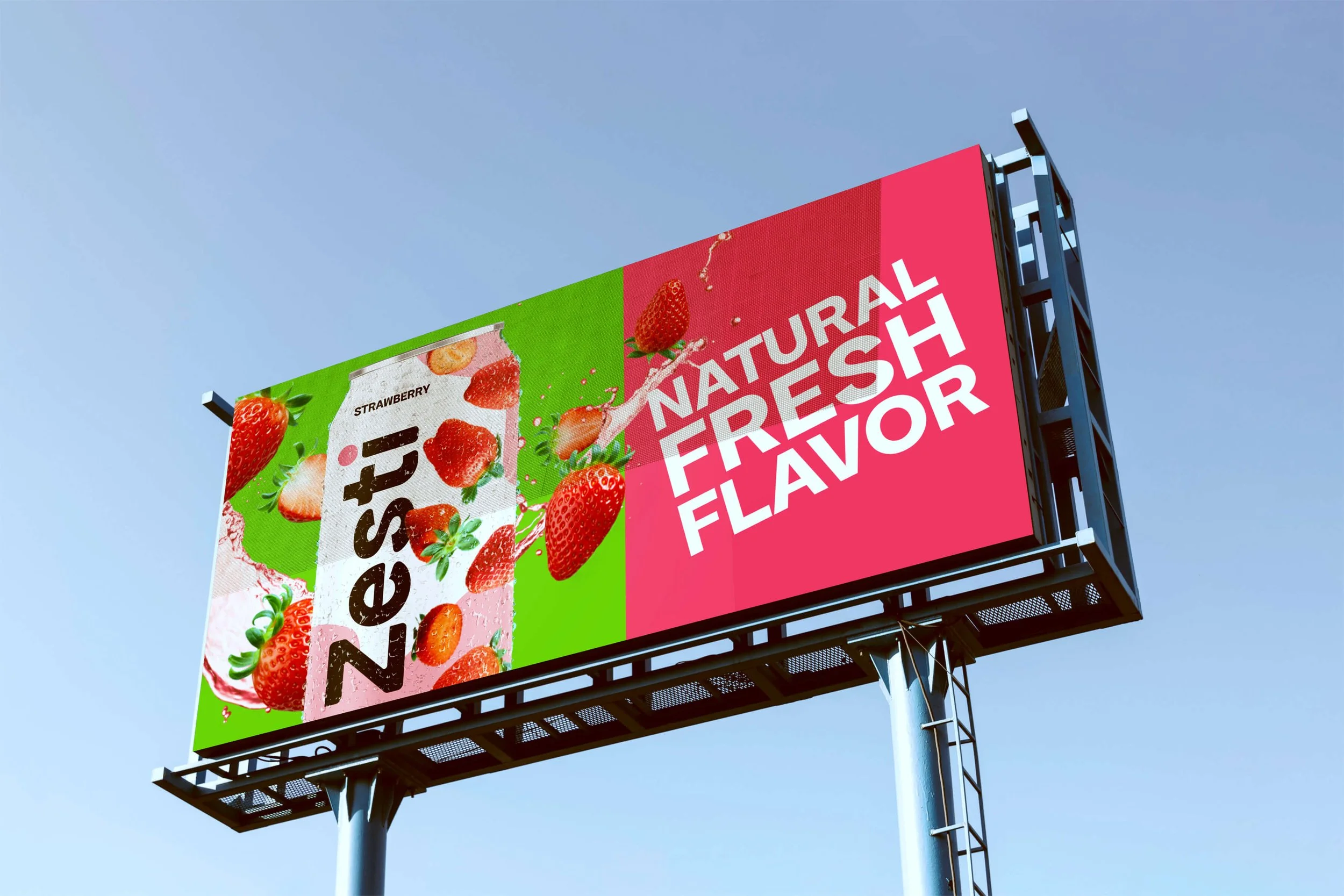
To capture the essence of the brand, I started with research into natural and organic beverage brands. I wanted the Zesti brand to evoke a sense of freshness and energy, while also having a throwback feel. So I chose a bright, bold color palette that reflected each drink flavor. Each drink has its unique assigned colors based on the main fruit flavor.
For the logo, I customized a round and airy sans serif font to convey the brand’s simplicity and vibrance. The logo features the word "Zesti" in bold, capital letters, with a small custom color dotting the letter "i" on each can to reinforce the natural ingredients found in each flavor.
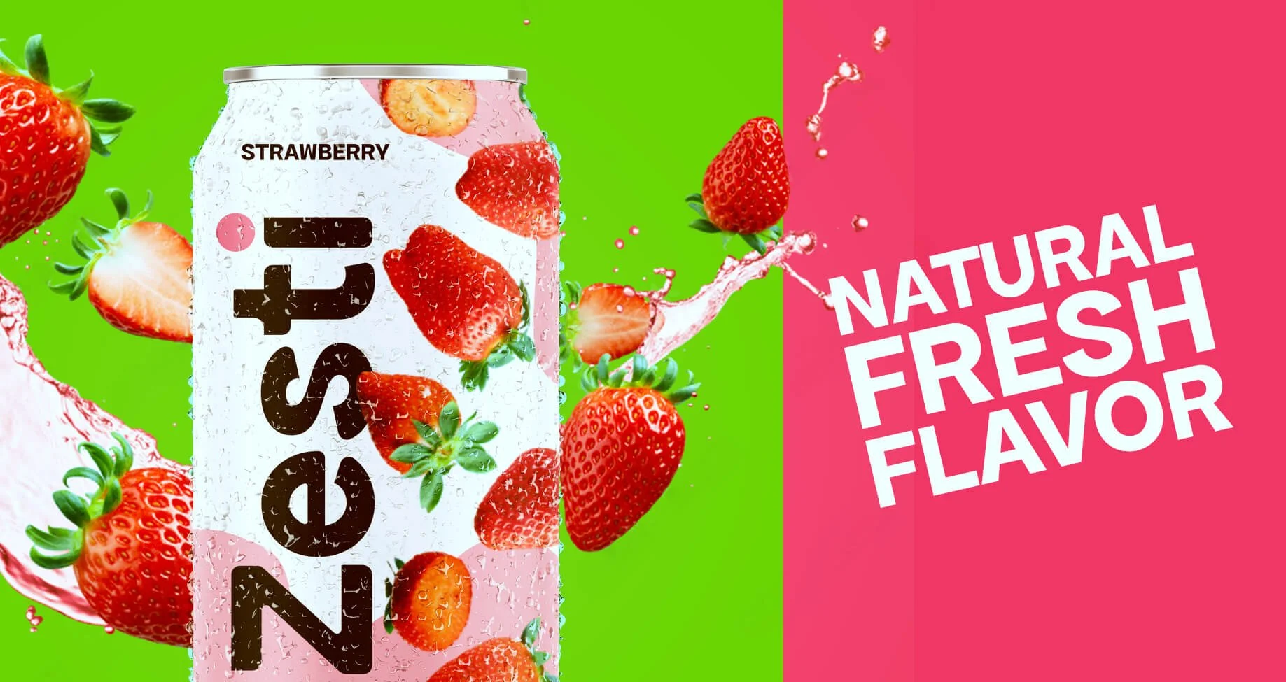
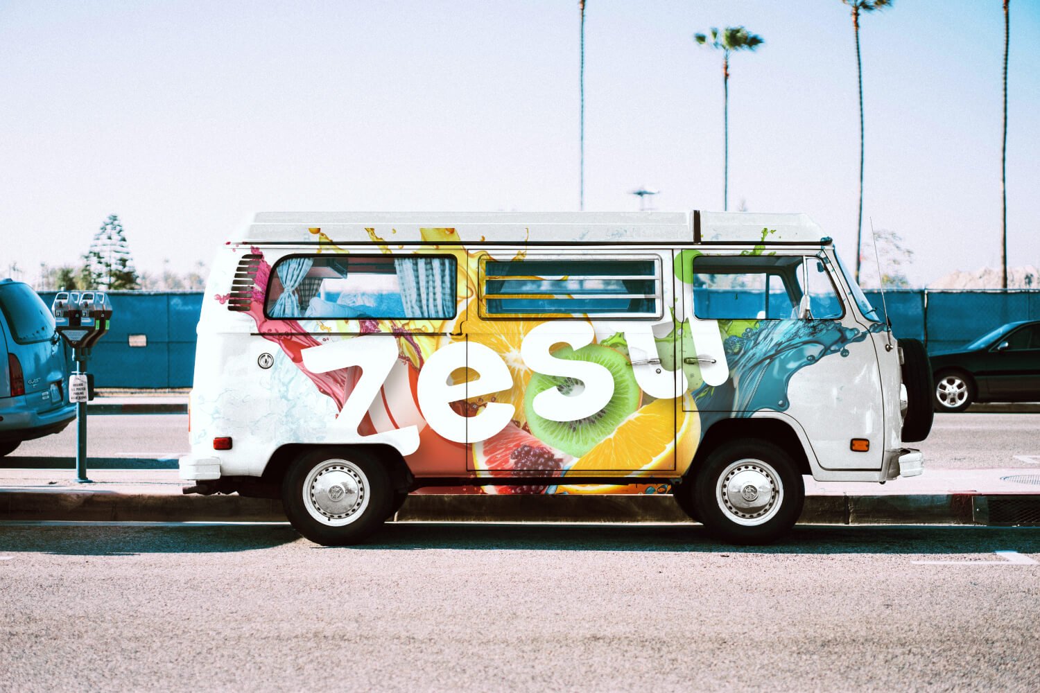
The packaging design features a clean and simple layout that allows the bright, bold colors and fruit illustrations to shine. Each flavor has a different fruit imagery to help consumers easily identify their favorite flavor. And the brand imagery includes bold color and contrast to give it a bit of that retro vibe.
PROCESS
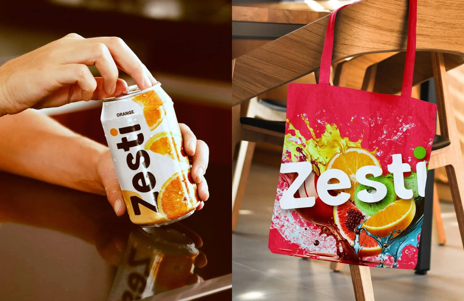
The final outcome is a vibrant and energetic brand identity and packaging design that conveys the refreshing and natural qualities of Zesti. The bold colors and fruit images on the packaging are eye-catching and playful, while the simple layout and clean typography emphasize the brand's commitment to using only natural ingredients. The Zesti brand is sure to appeal to health-conscious consumers who value natural ingredients when choosing their beverages.